More on Rule of Thirds
Here is More on Rule of Thirds. This is such an important concept for creating interesting photographs. This was a contribution from Rachel Clearly from her photographytalk: https://www.photographytalk.com/beginner-photography-tips/7148-the-rule-of-thirds
The rule of thirds breaks an image into nine equal quadrants using two vertical and two horizontal lines, as seen in the sample image of the Great Wall of China. The resulting grid shows you where to place elements of interest in the shot such that they have maximum impact – along one of the four grid lines, or, even better, at one of the four intersecting points where the horizontal and vertical grid lines meet.
Using the image of the Great Wall of China as an example, note how the wall in the foreground and the tower both align with the leftmost vertical line of the grid. Note how the horizon line – the mountain peaks in the background – roughly align with the uppermost line of the grid as well. The photographer has used the rule of thirds to place these elements of interest along planes that maximize their impact, just as the rule suggests you do.
The How and the Why of the Rule of Thirds
Here is more on the rule of thirds
Our eyes tend to avoid the center of a shot, instead, going first to the areas where the rule of thirds lines intersect. Thus, placing objects of visual interest at one of those intersection points makes sense. It’s a way to use our natural visual tendencies to grab the viewer’s attention and pull them toward the subject of the shot.
Quite simply, it’s a more interesting shot to view than if she had been placed smack in the middle of the frame. By shifting her to one side, the viewer’s eye has to move around to find her. Additionally, because there is so much space to explore on the left side of the image, it becomes a much more interactive photo.
Let’s use another image to further illustrate how the rule of thirds helps create a more interactive image.
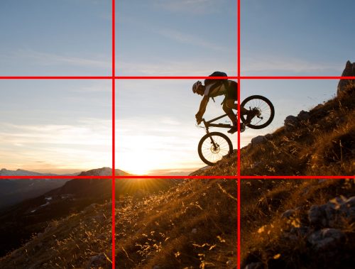
Looking at the sample image of the mountain biker, you can see that, again, the subject has been placed to the right of center near the rightmost vertical grid line (note how the biker’s body aligns well with the uppermost grid line as well). With his placement there, the eye is drawn to the right side of the photo. But, because the biker’s movement is clearly going to the left, the eye now follows that implied movement to the left as well. The result is that you engage more deeply with the photo because the eye has a place to go.
What’s more, even though the biker is shifted to the right side of the image, there is the perception of greater balance in the photo. If he’d been placed in the middle of the frame, the image would feel static and stuck. There would be no visual space for the biker to move into, nor would your eye have anyplace to go. So, even though there is more interest in the right side of the shot, the ability for our eyes to move to the left to see where the biker is headed allows the image to seem more balanced.
The Rule of Thirds and Horizons
The rule of thirds has an additional use – making images more interesting through the placement of horizons. Generally speaking, if you’re presented with a scene that has a lot of interesting elements in the foreground – or, conversely, has an uninteresting background – placing the horizon near the uppermost horizontal grid line helps you maximize the view of the interesting foreground elements.
In the sample image of the seascape, you can see how this strategy works. The sky has some interest, but the texture in the foreground rocks is far more interesting. By shifting the horizon upwards, the photographer is able to give us a better glimpse of those rocks, thereby introducing more texture and color into the scene.
Additionally, shifting the horizon line towards the bottom of the frame and placing it nearer the bottommost horizontal grid line, you can highlight an interesting background and minimize the view of a foreground that doesn’t offer much visual interest. This strategy works well in the image of the Northern Lights because it allowed the photographer to give us a fuller view of the gorgeous sky while minimizing the featureless and dark lake in the foreground.
When to Break the Rule of Thirds
Now that you have a deeper understanding of the rule of thirds, how it’s used and why, we can discuss why breaking the rule can be as advantageous as complying with it.
If you think about the purpose of the rule – to add interest and balance to a shot – there are instances in which completely breaking the rule actually gives the image more interest and balance.
This concept works with portraits as well. Consider this portrait of 3 girls. Their image is exactly in the middle of the photography. This draws emphasis to the girls rather than their clothing or the grass. I wanted to emphasis their faces. You could still say their is an element of 3 in the photo but you get my point.
Final Thoughts
The rule of thirds is a valuable tool that has made countless photos better over the years. Yet, as we’ve learned here, there is a time and a place for using the rule and instances in which it’s best to simply throw it out the door. By practicing using the rule of thirds, you’ll become more adept at knowing when to use it and when to skip it. The result? More compelling images that keep viewers engaged.


